


A Year in Photos
How to Tell a Consistent Visual Story in Your Annual Photo Book
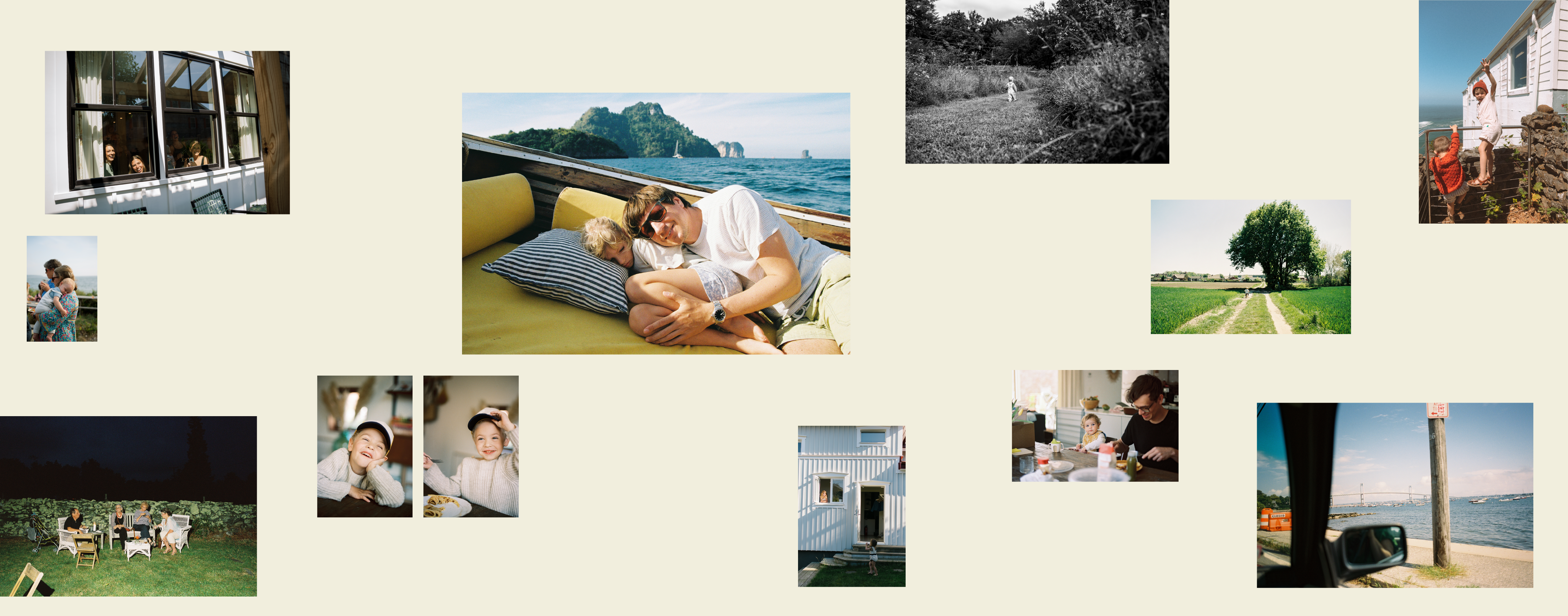
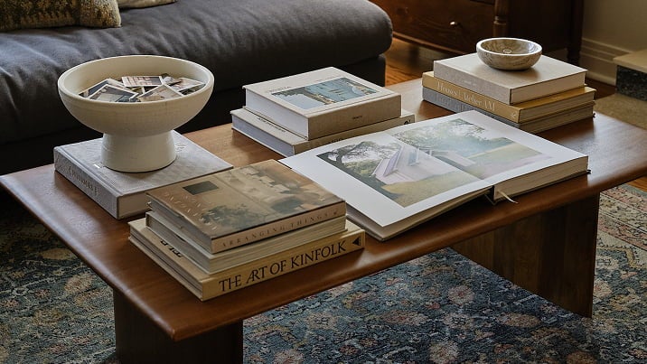
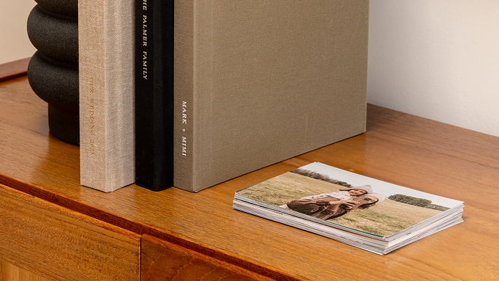
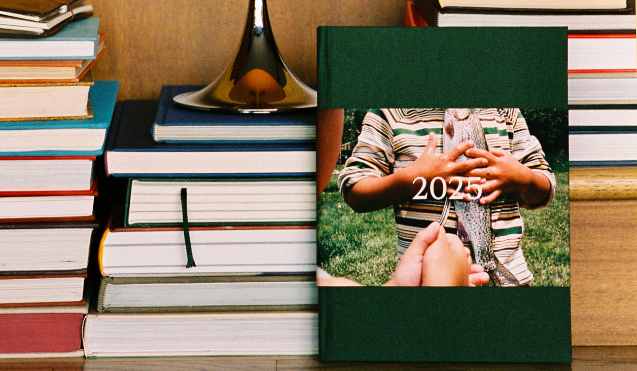
You’ve decided to start (or continue!) the tradition of building an Annual Album.
You’ve collected all of your photos from the past year, and you’ve curated down to
which ones tell the best stories — now you’re unsure of how to thread together a
continuous story through each chapter bead on your year’s necklace. Read on to see
our five creative ideas for how to tell a consistent visual story across your year’s
worth of moments and memories.
This article will give tips to build layouts within a variety of our photo books
and albums.
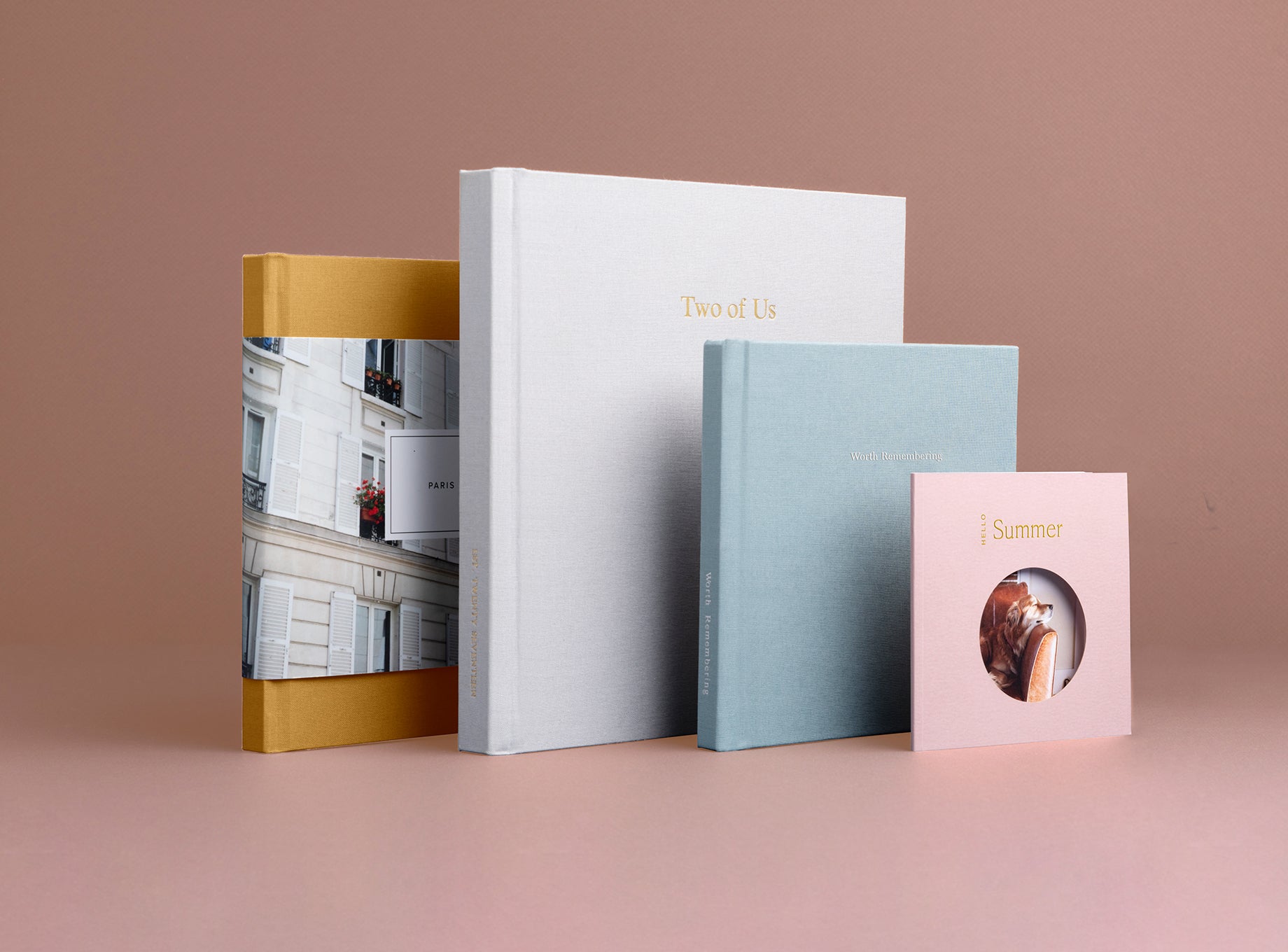
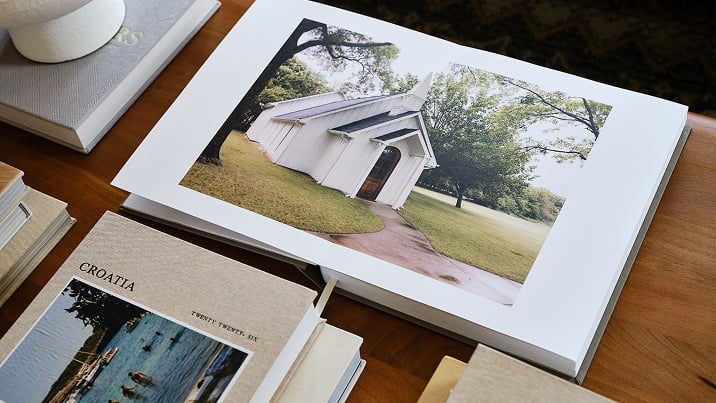
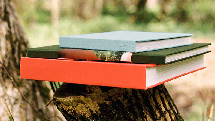
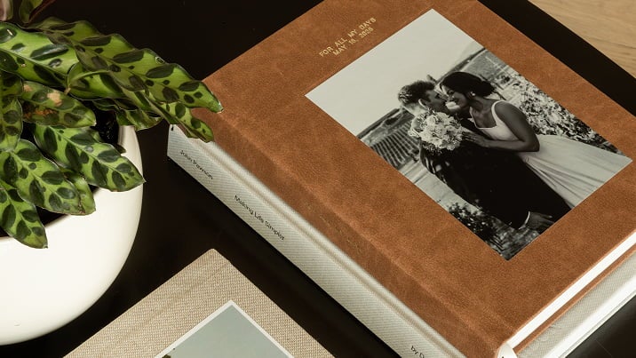
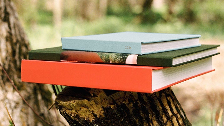
Check out our favorite books
to start building your annual album.
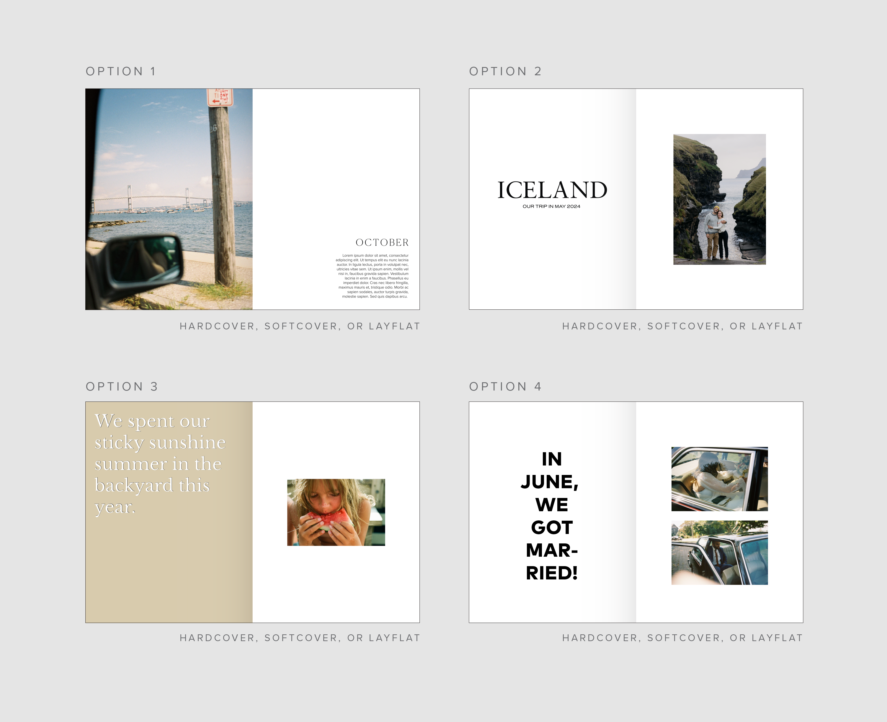
Style 01
Same Layout Throughout
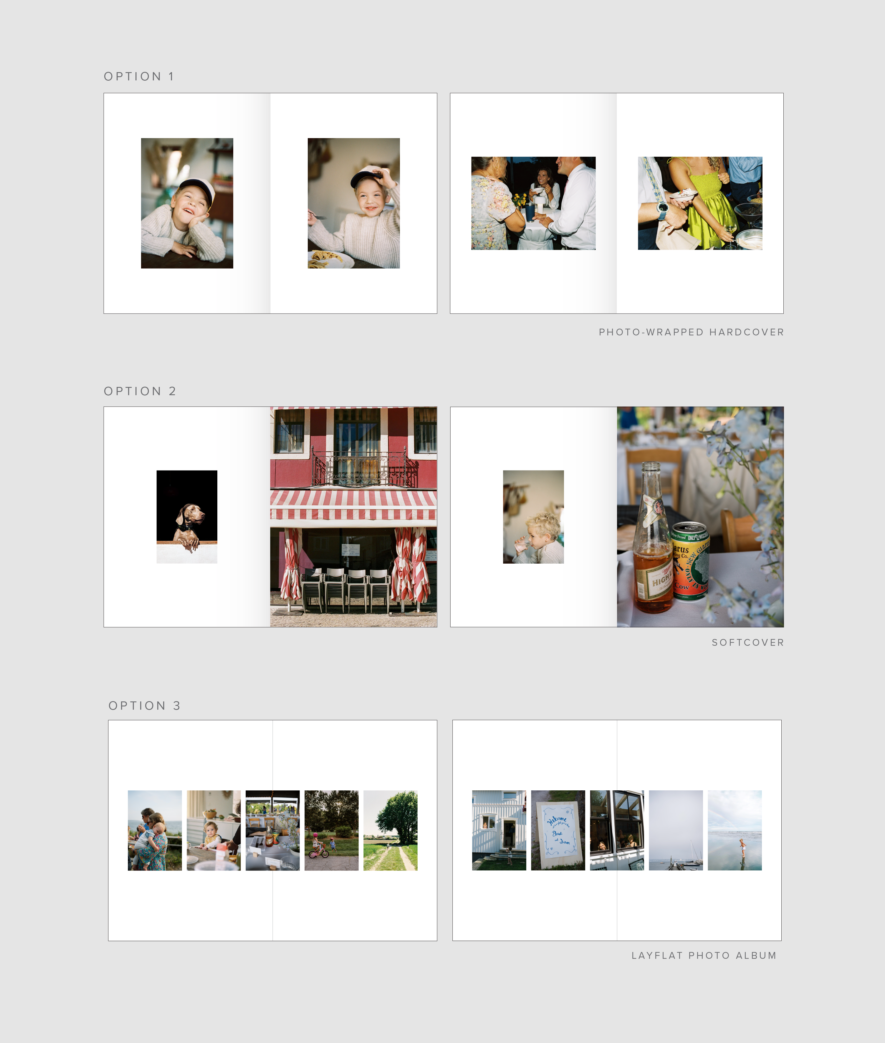
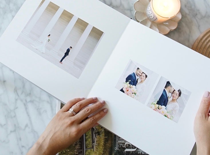
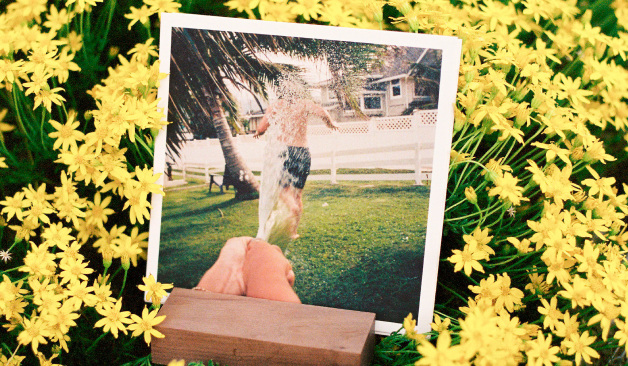
One of the easiest ways to create visual continuity across many different photo styles and settings is to use the same photo layout throughout the whole book. Whether it’s the same layout on each page (Option 1) or the same layout per page spread (Options 2 and 3), the consistency helps to minimize the visual differentiation across all of your photos.
Style 02
Same Color Throughout - Black and White Filter
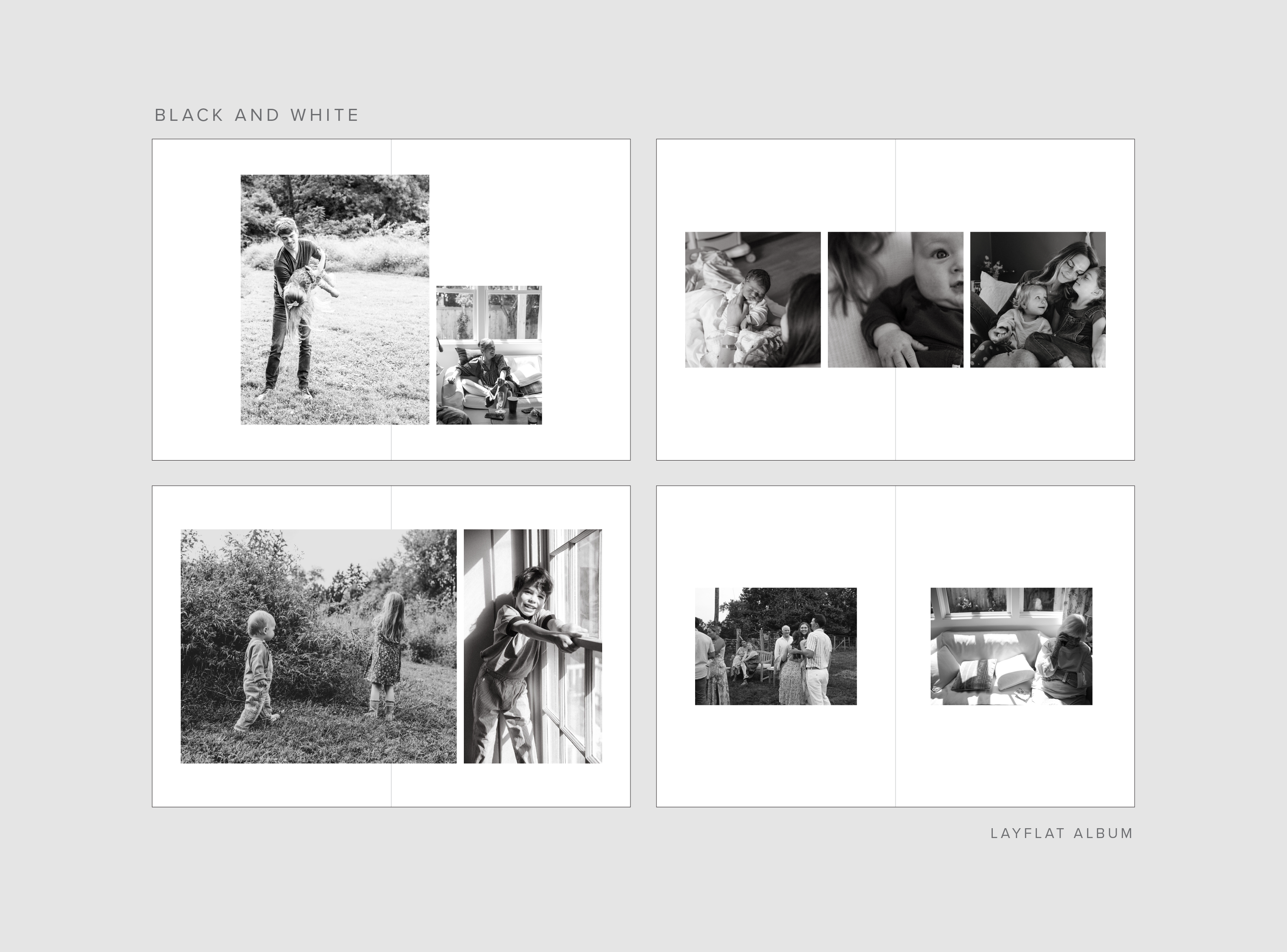
Another easy way to make a group of unalike photos look more similar is to
apply a black and white filter to all of them. This provides such a strong
visual flow. Feel free to use any layout across the whole book to balance
out the subtlety of the black and white photography.
Pro tip: Use the black and white filter option in the
Artifact Uprising Books Editor
to filter them all in one place.
Style 03
Same Color Throughout - Pop of Color
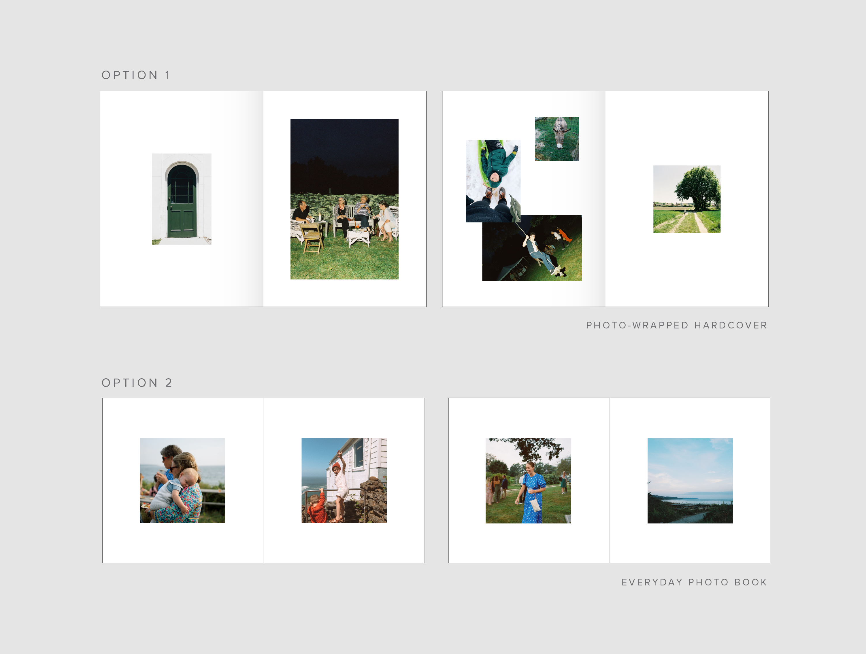
Or if you’re interested in a challenge, look for the same or similar pops of color across all of your year’s photos and put only images that have pops of that specific color into the book. We suggest something easy like blue or green!
Style 04
Handwritten Captions and Elements
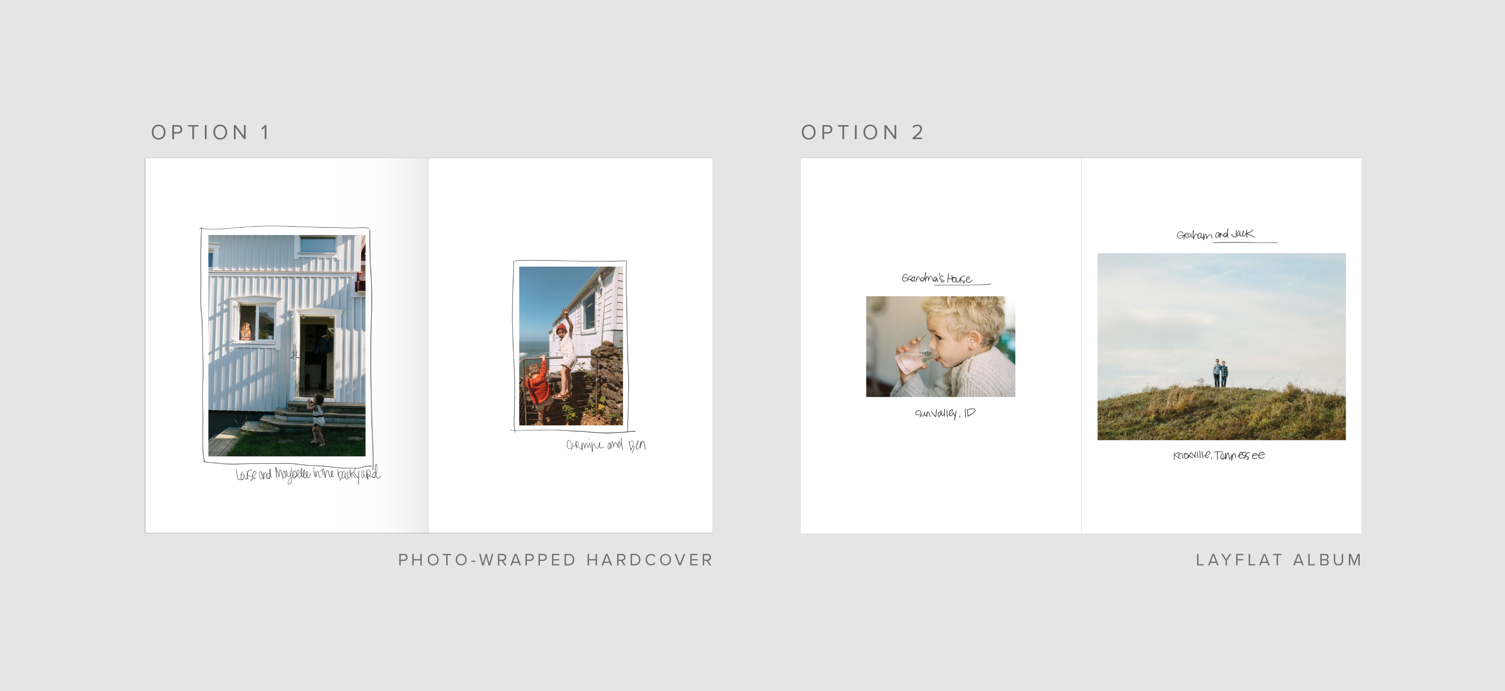
An easy and cool way to add some personality and coherence to your year’s
photos is to handwrite your captions and draw little elements that
accentuate each photo. (We know it can be intimidating to write in a newly
minted book but we often remind ourselves that there’s beauty in the
imperfections.) So sit down, grab your favorite beverage and enjoy flipping
through your album adding a few extra touches.
Pro tip: If you want to handwrite in your photo book, make sure to choose matte
or superfine paper - it will hold the ink without smearing.
Style 05
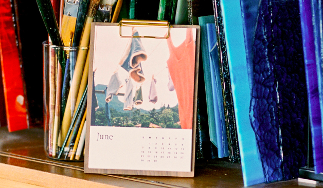
Use the Text Only Layout Option as a Chapter Page
If nothing else, a fun way to create visual uniformity is to separate out
each time period or grouping of similar-photos by using chapter or section
dividers. Our ‘Text Only’ page layout is perfect for this use-case (you can
find the ‘Text Only’ layout option at the bottom of the layouts drawer in
the editor).
Pro tip: To achieve the looks above, use multiple text boxes with
different fonts and sizes. Play around until you find a style that fits
you and then repeat throughout the book.