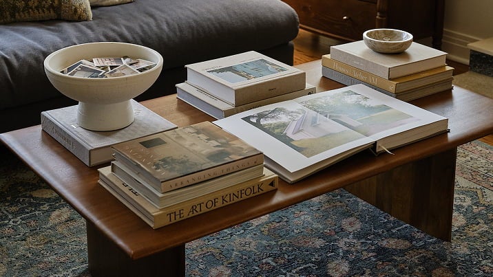


Editing
Tip 01
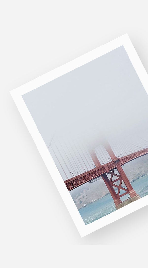
Edit Before You Upload
While editing photos can feel like an extra step in your preparation stage, you’ll be happy you spent the time upfront. There are a couple of main benefits to this: you can control the consistency of aesthetic across the photos you print, and it prevents you from having to double back later after uploading.
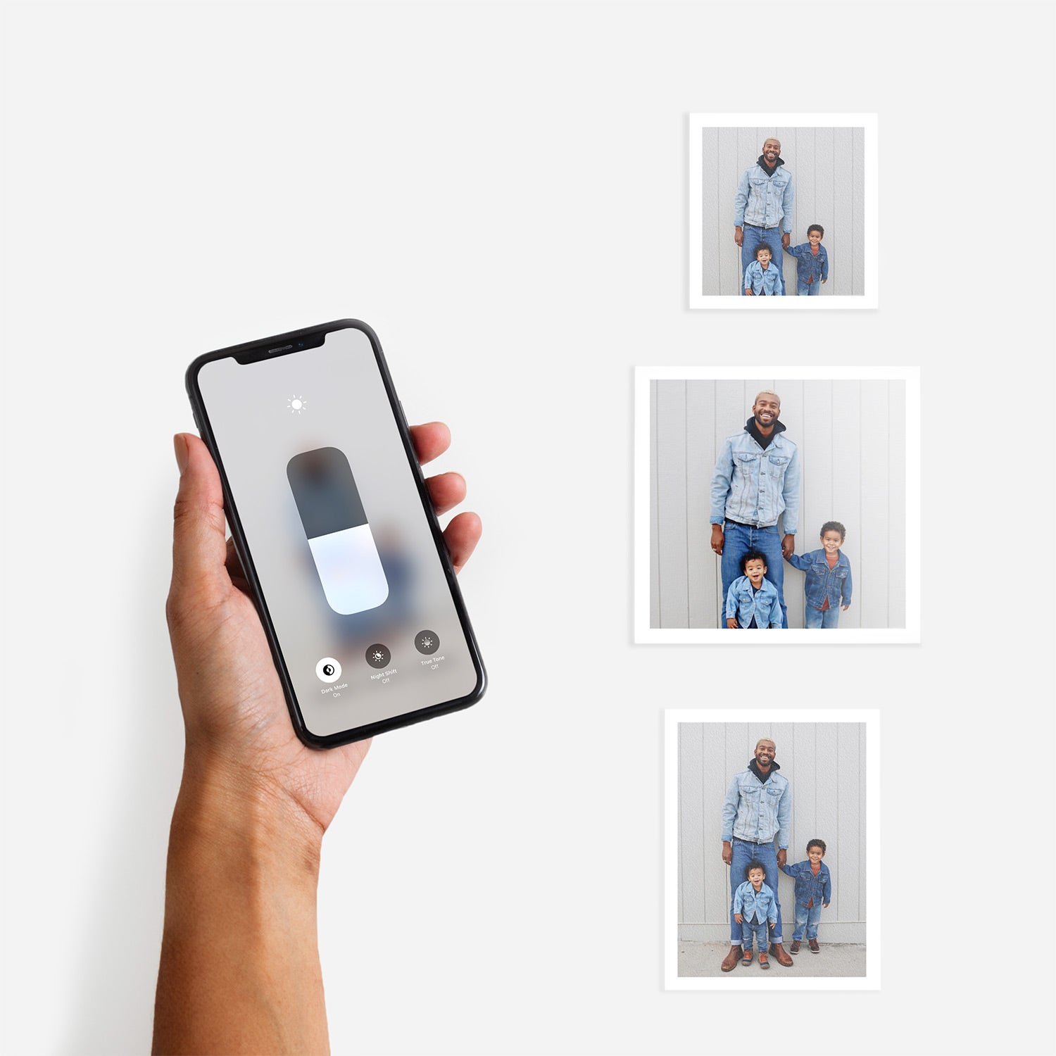
Some online photo project editors, like ours, include very basic editing capabilities (like brightness or cropping). However, you’ll enjoy the most flexibility and control with apps and programs made specifically for doctoring photos.
Check out our Mobile Photo Editing Tips for ideas like selecting favorite frames from camera bursts or enhancing colors before sending photos off to print.
Tip 02
Try Presets for Easy Edits
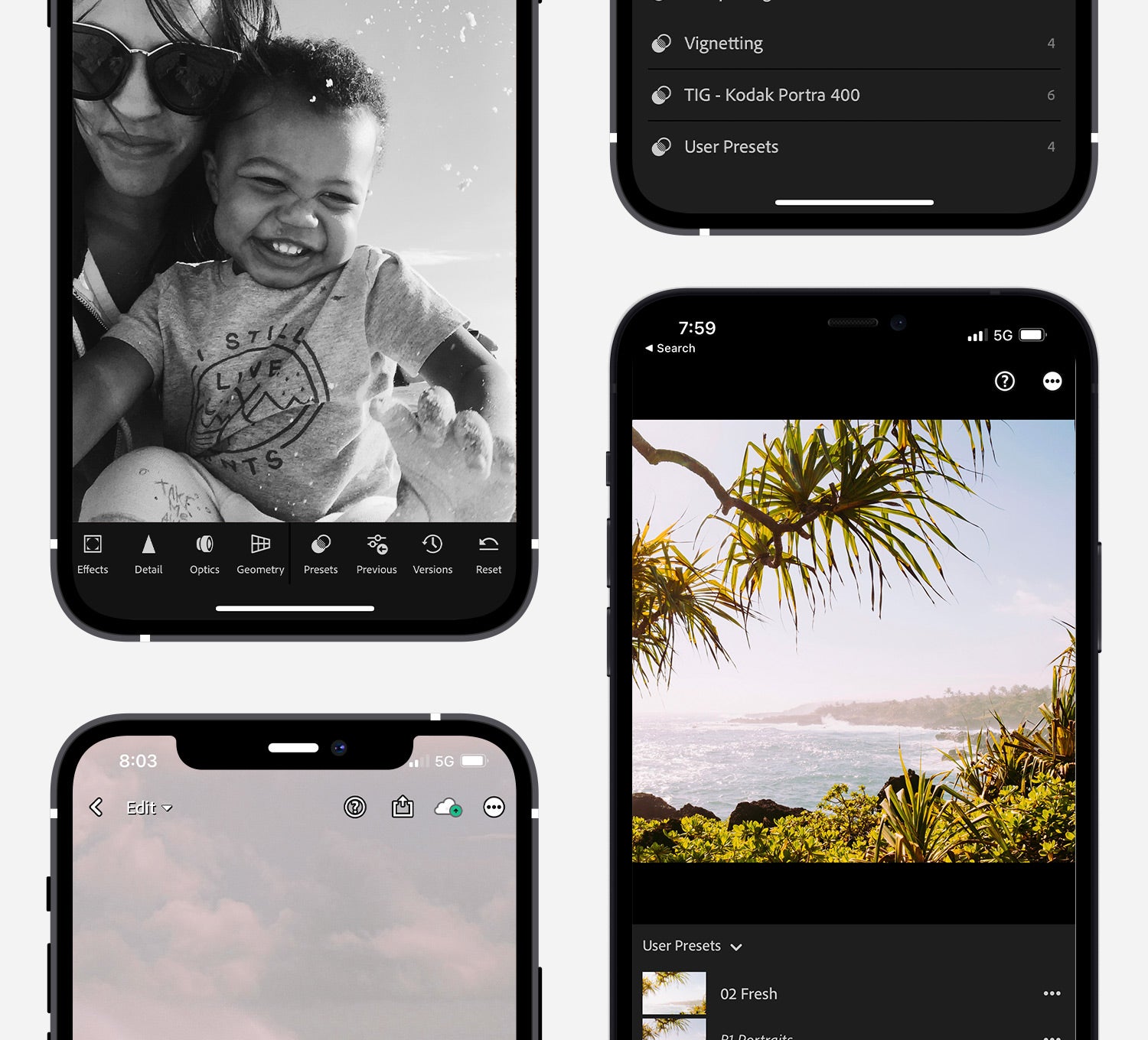
The easiest way to get a consistent look with your photos before printing is by using presets. Also known as filters, presets let you make similar adjustments across a set of images, which is especially handy for photos taken in the same setting, shoot, city, or conditions.
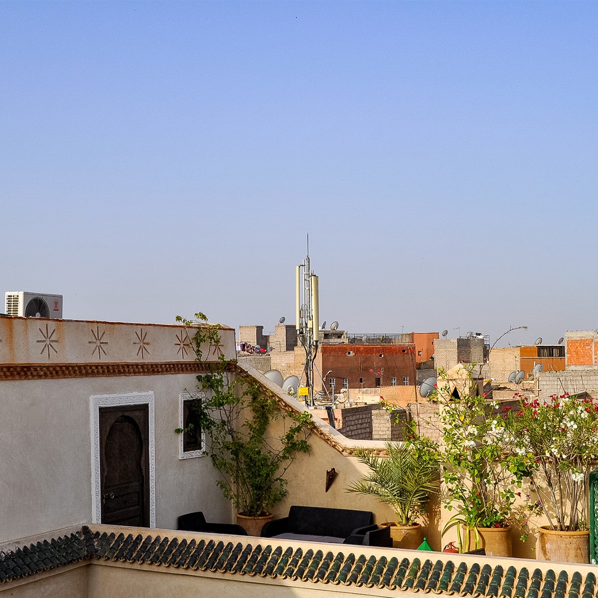
We’ve got a few favorite (and free!) Lightroom presets and VSCO recipes available for you to download, as a starting point. Check out the image right below to see just how much of a difference a simple preset can make!
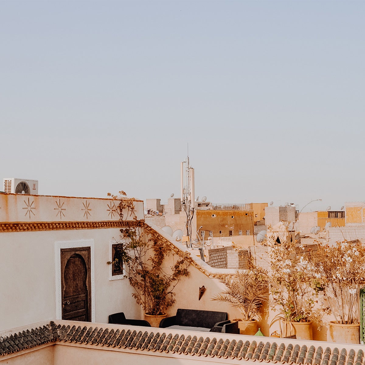 Preset
 Original
Tip 03
Crop Wisely
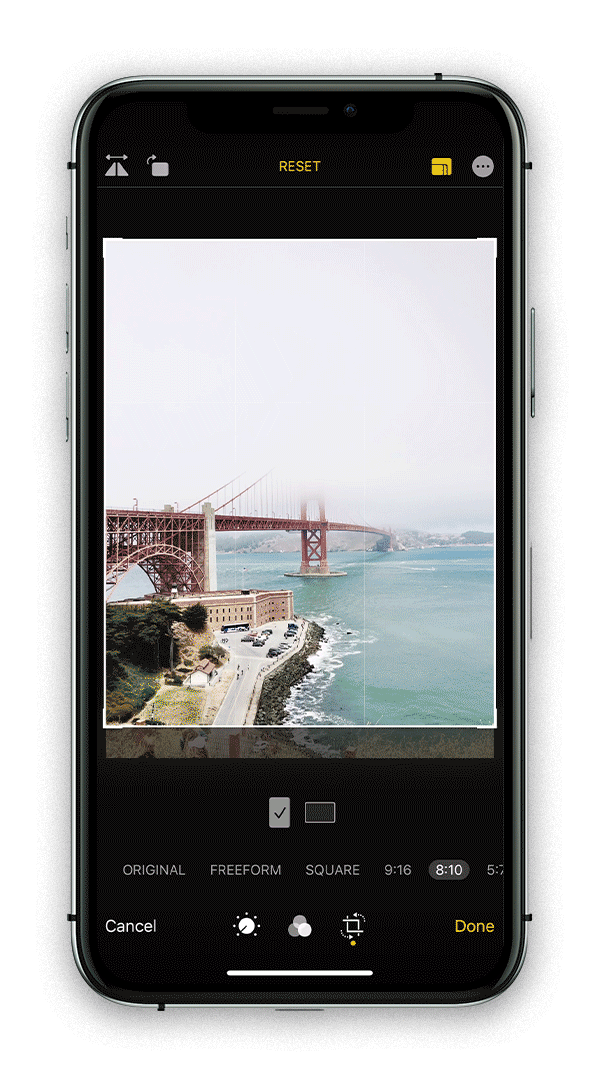
Cropping may seem basic, but it can be a powerful tool. To maximize the quality and resolution of your photo, it should be used sparingly. Try not to rely on cropping your photo in post, and instead, prioritize getting the composition you want through your camera, when possible. That said, you never know when a foreign or immovable object makes its way into your shot. This is the best time to employ a cropping tool — to remove distractions and focus in on the subject at hand.
Tip 04
Adjust Brightness
High-resolution, backlit digital screens render photos differently than light bouncing off printed physical paper. Especially on our uncoated matte paper, ink absorbs into the fibers and images can look a little darker in print. Therefore, it’s often necessary to account for this translation by brightening your photos a bit.
We recommend to start by dropping your screen brightness down slightly (to about 50%), then making any adjustments to brightness or contrast from there to help ensure a clear print. Weed out darker or poorly lit photos whose subjects are hard to decipher or that lack contrast, because those qualities will only be magnified without the artificial lighting on your digital screen.
File Adjustments
Tip 05
Ensure Proper File Types
Before heading to upload, you’ll want to double-check that all images are either JPGs or PNGs. Not only are these the most common image file types, but they’re also the only ones that will upload to your project in the editor.
What other kind might you run into? Sometimes, iPhone images save in the newer .heic file format, which is handy for efficient storage space but not compatible with most third-party applications. Always remember to convert HEIC or other files first — which is easier than it sounds!
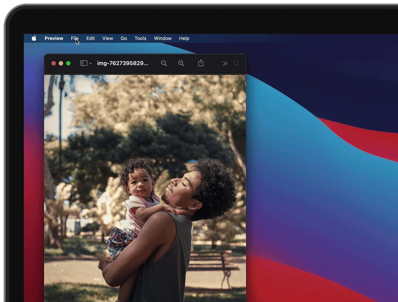
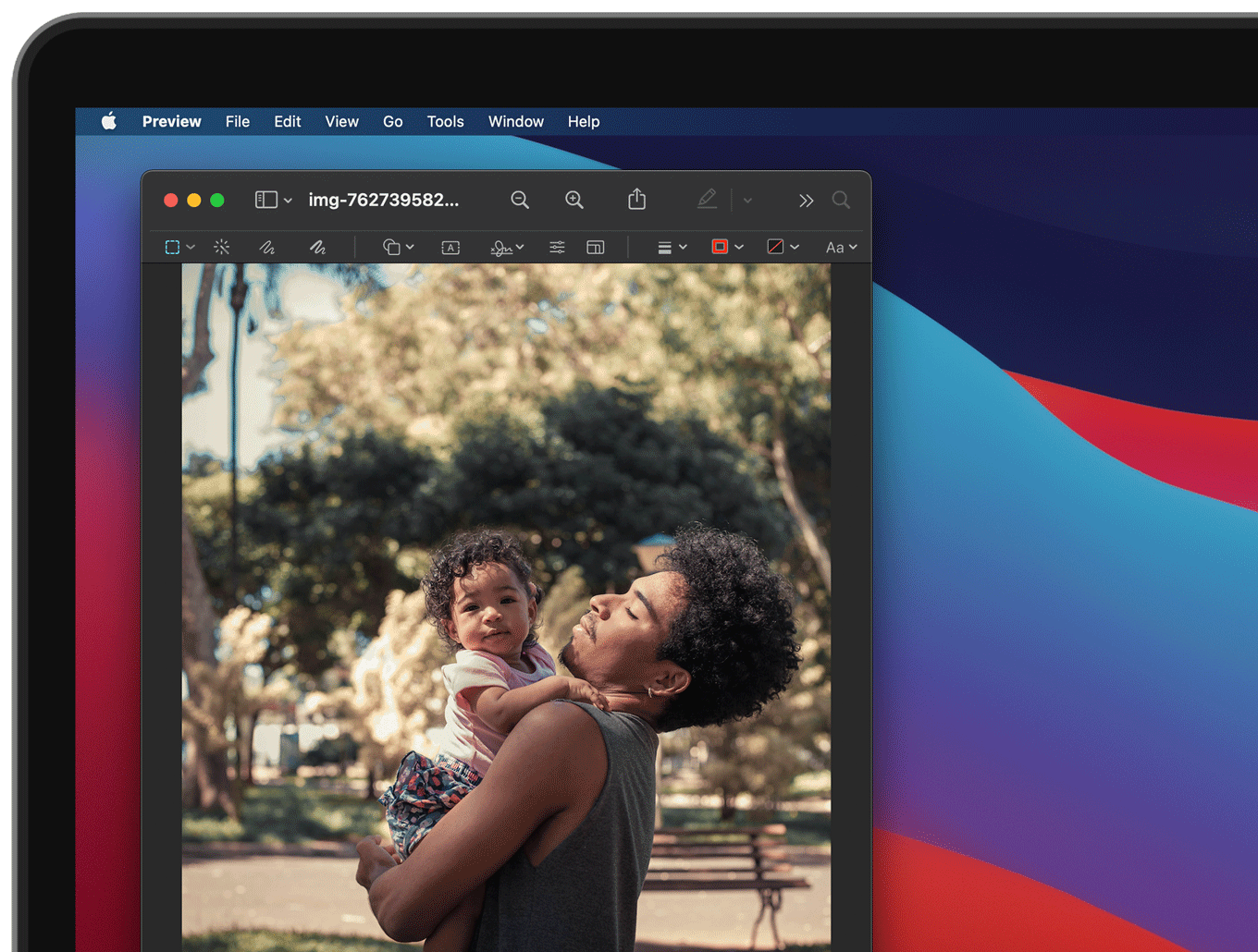
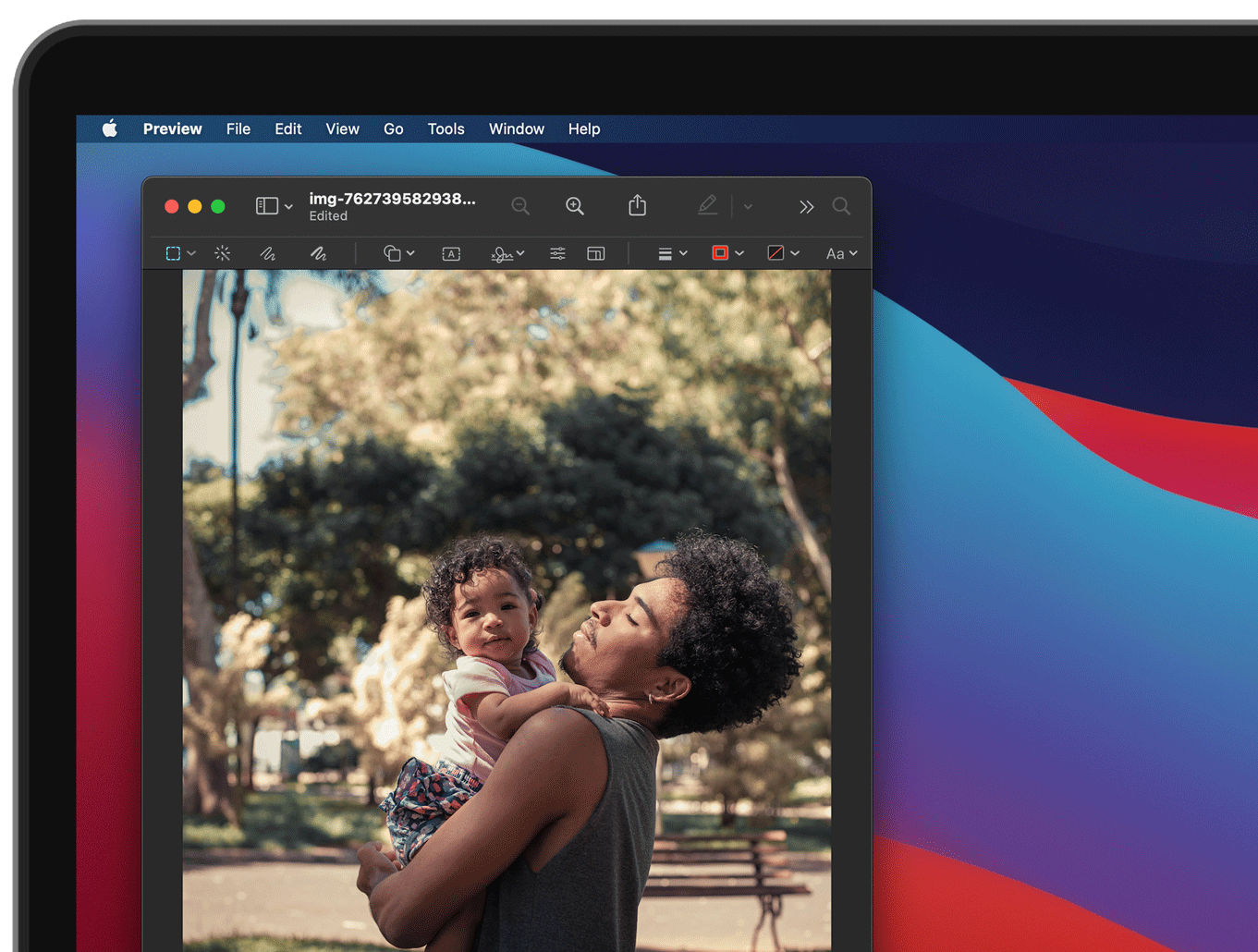
On a Mac, go to Preview > File > Export. In the Format section, choose JPEG or PNG and save. Alternatively, here’s a trick to set up a "quick action" on your computer to convert the files in bulk. (Using Windows? There are just a few extra steps.)
Tip 06
Size Up Your Image
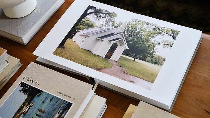
The size or quality of an image can make or break how it prints. While phone photos or imports from social media sources can certainly translate well to paper, we recommend keeping the resolution at 300 DPI (dots per inch) for the highest quality. Letting DPI dip lower than 150 results in a warning in our project editor and sometimes a grainy or fuzzy appearance when printed.
Receiving Images From Someone Else?
Ensure the highest resolution by opting for a photo-sharing app like Dropbox or Google Photos, or Airdrop directly to each others' devices. Keep in mind that sending and receiving files via text message compresses their size and quality!
Layout Pointer
If this is a photo you plan to feature on its own page or blown up in a large frame, remember that the bigger the layout placement, the higher the resolution you’ll need for the image file to fill it.
See our handy guide, How to Enlarge a Photo for Printing, for step-by-step instructions that can help you adjust your DPI. Keep in mind: Images must also have a file size less than 25mb to be uploaded to our site.
Tip 07
Double-Check Color Profiles
This guideline is easy to forget, but can be recognized by professionals or perceptive eyes. When it comes to color profiles, it helps to first understand the difference between RBG and CMYK settings on your image files. Both are acronyms about how color renders on a given medium: RBG stands for Red, Blue, Green and is mostly used for digital displays; CMYK stands for Cyan, Magenta, Yellow, Key/Black and is mostly used for printed designs.
Although we print in CMYK color mode, we require that images are uploaded in the sRGB color profile, because that helps keep file prep coming from digital devices as consumer friendly as possible. If any other color profile is used for uploading (such as Adobe RGB), the printed result may have unpredictable variations in brightness, contrast, or coloring.
Here’s how to change your color profile on Macs, Photoshop, and PCs, if you need some guidance!
Paper & Printing Considerations
Tip 08
Our Press Printing Aesthetic
We choose to print solely on HP Indigo Presses, known for their ability to maintain color consistency in digital printing, as well as using actual ink that absorbs properly into the paper. Press printing also allows us to formulate our own unique color profile on press, fine-tuning color curves to give your images a warm and pleasant look. It’s this soft aesthetic that our customers have come to know and love in our products, but it’s worth mentioning so you know just what to expect!
Tip 09
Accommodate for Paper Type
Paper type is another element of the printing process that affects how your end product appears. Across our product lines, you may see paper options including matte (or superfine), lustre, or satin. Each has a unique look and feel, absorbing ink and light to varying degrees.
Knowing this, we’ve outlined the differences, with photo printing tips to help you make prior adjustments:
Matte/Superfine
Found across all of our photo books, calendars, prints, and cards, matte paper results in soft color tones on paper with a lightly textured feel. This paper type is most absorbent of ink, giving your photos a warm and subdued aesthetic. To optimize for matte-finish paper, you may want to turn up your image’s brightness and contrast to retain clarity.
Lustre
An option specifically in our Layflat Album line, lustre results in richer color tones on paper with a light sheen. Similar to but less exaggerated than the satin finish below, this paper type keeps ink at the surface more than our matte option. Therefore, it gives your photos a bit more “pop” and capacity for showing smaller details.
Satin
Available with our Everyday Prints, satin paper results in our richest color tones on paper with a smooth finish. Satin relatively resembles a traditional glossy print, which shows the most color contrast and reflects the most light. Therefore, your images will benefit from more vibrance and clarity, with little augmentation needed during the editing process.